Vue Chart Component with Chart.js
Chart.js is an amazing chart library for JavaScript. It’s modern and performant; built on top of the HTML5 canvas. It includes 8 different chart types which super easy to extend and configure. On top of it all, the generated chart just looks beautiful.
Last night I did some tinkering to integrate Chart.js within the existing Vue code base. So, how can we do that? If you want, there’s actually a wrapper for Chart.js already available for Vue: vue-chartjs. If you take a look at the vue-chartjs source code, it’s actually pretty simple and straightforward. So let’s try to build one ourself!
You can check out the final working source code on Github. You can also visit the demo here: risan.github.io/vue-chart-example.
Table of Contents
Creating New Project
On this tutorial, I will use Vue CLI version 3 to scaffold my project. But of course you can always use your own build system as long as it can handle the Vue Single File Component—if not you have to slightly modify the component declaration by inlining the <template>’s content into your template property.
If you want to use Vue CLI and doesn’t have one installed on your computer, run the following command on your terminal to install it:
$ npm install -g @vue/cli

# Or if you prefer to use yar.
$ yarn global add @vue/cli
Next, let’s create a new project with Vue CLI:
$ vue create vue-chart-example
You’ll be prompted to choose the preset, I choose the default one which will configure Babel and ESLint for us. Then you’ll be asked to choose the package manager to use: Yarn or the default NPM. The installation should be started, just wait until your project is created.
You’ll get a similar output upon a successful project creation:
🎉  Successfully created project vue-chart-example.
👉  Get started with the following commands:

$ cd vue-chart-example
$ yarn serve
Now, let’s run our project:
# Go the project's directory
$ cd vue-chart-example

# Build and run the project.
$ npm run serve

# Or if you use yarn.
$ yarn serve
Once the development server is running, open the localhost:8080 address on your browser. You should see your Vue project.

Press CTRL + c to stop the development server. We’re going to code from scratch, so we won’t need any of the provided boilerplate code on src directory. Let’s delete them!
$ rm -rf src/*
Getting Started with Chart.js
Open your terminal, and type the following command to install Chart.js:
npm install chart.js

# Or if you prefer to use Yarn.
yarn add chart.js
Note: if you use NPM prior to version 5, you need to provide the
--saveoption to automatically update thedependencieslist on yourpackage.jsonfile.
Here’s the constructor’s signature on how to initialize a new Chart.js instance:
new Chart(context [CanvasRenderingContext2D|Element|String], {
  type: String,
  data: Object,
  options: Object
});
context: It can either be an instance ofCanvasRenderingContext2Dinterface, anElement, or aStringof the canvas’s id.type: This is the chart’s type likeline,bar, orpie. Check out the Charts Section on the docs for a complete reference.data: It will contain thedatasetsproperty which is the data that will be used to plot the chart.options: Chart configuration options, like responsiveness, legend, axes, title, etc.
Plot a Line Chart
Confused? Let’s create some line chart with Chart.js! Open the public/index.html file, then add a new <canvas> tag within the <body>. This canvas tag is where we will plot the chart.
<!DOCTYPE html>
<html lang="en">
  ...
  <body>
    <div id="app"></div>

    <!-- Put canvas tag here. -->
    <canvas id="my-chart" width="500" height="300"></canvas>
  </body>
</html>
Now let’s recreate the src/main.js file. This is the default entry point for the project scaffolded by the Vue CLI.
import Chart from 'chart.js';

new Chart(document.getElementById('my-chart'), {
  type: 'line',
  data: {
    labels: ['Jan', 'Feb', 'Mar', 'Apr', 'May'],
    datasets: [
      {
        label: '2018 Sales',
        data: [300, 700, 450, 750, 450]
      }
    ]
  }
});
Note that we don’t pass any options property for now. Let’s run our project again:
$ npm run serve

# Or
$ yarn serve
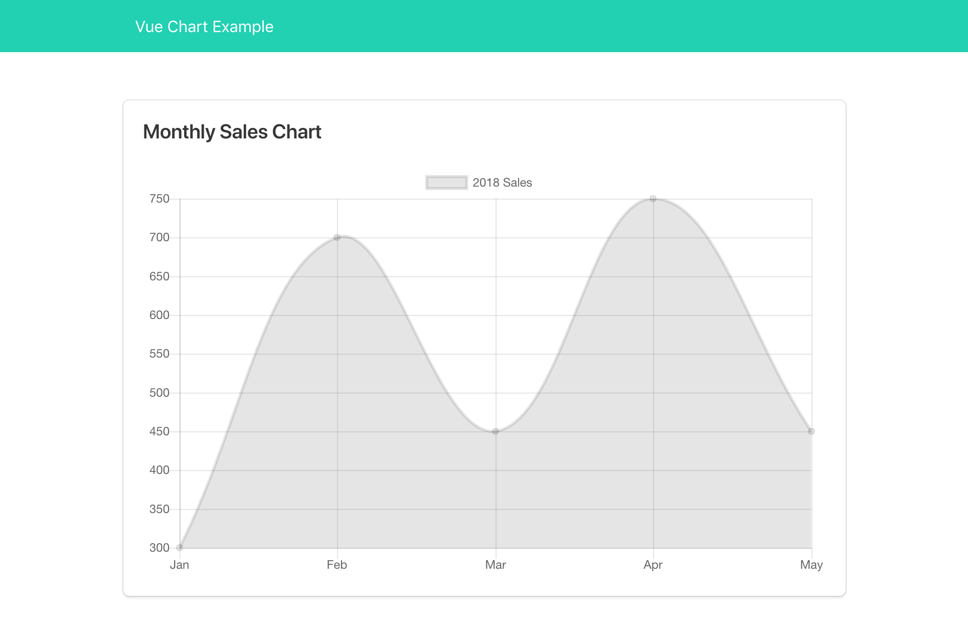
You should now see your line chart plotted on the browser!
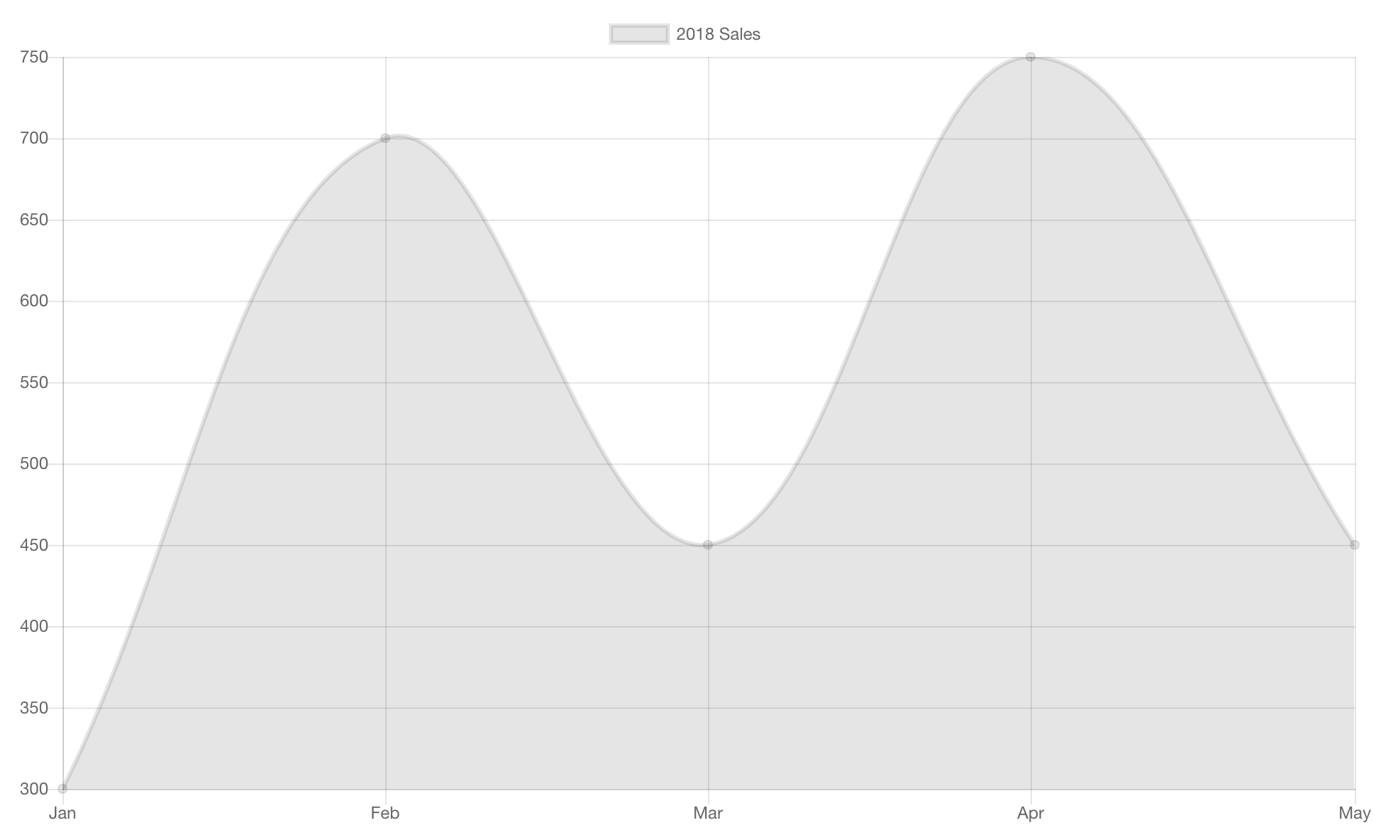
Note that even though we set the width to 500 and the height to 300, the generated chart will occupy the entire screen. That’s because, by default, Chart.js will generate a responsive chart that will occupy its parent container. You may also notice that even though it’s stretched out, by default Chart.js will still maintain the original aspect ratio (5:3).
If this is not the way you want it to be, you can always override this behavior. Read more about responsive chart.
Data Format
As you may see the data property holds a datasets property. This is an array of data that we want to plot on the chart. By default, on line-chart, these data will be represented on y axis (vertical axis). These data can also be formatted in {x, y} format:
{
  label: '2018 Sales',
  data: [
    { x: 0, y: 300 },
    { x: 1, y: 700 },
    { x: 2, y: 450 },
    { x: 3, y: 750 },
    { x: 4, y: 450 }
  ]
}
Labels
On line-chart, by default the data.labels property will be used as the label on x axis (horizontal axis). Each item on data.datasets will be paired with the item on data.labels.
We can also configure the labels by passing it into options.scales.xAxes options instead:
import Chart from 'chart.js';

new Chart(document.getElementById('my-chart'), {
  type: 'line',
  data: {
    datasets: [
      {
        label: '2018 Sales',
        data: [300, 700, 450, 750, 450]
      }
    ]
  },
  options: {
    scales: {
      xAxes: [{
        type: 'category',
        labels: ['Jan', 'Feb', 'Mar', 'Apr', 'May'],
      }]
    }
  }
});
Multiple Datasets
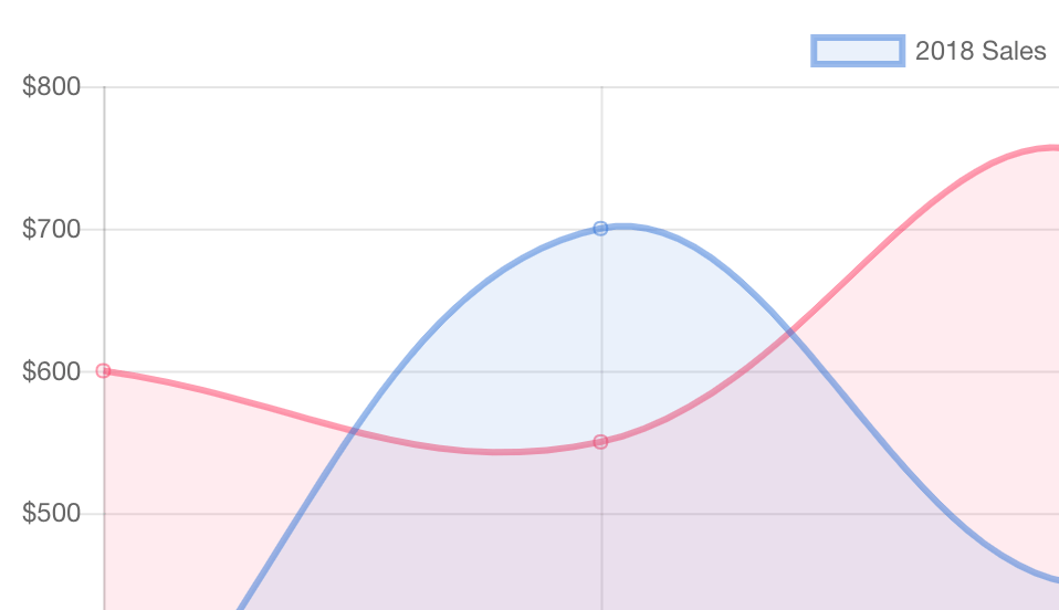
We can, of course, provide as many datasets as we like. For this example we’ll add another dataset for 2017 Sales:
new Chart(document.getElementById('my-chart'), {
type: 'line',
data: {
labels: ['Jan', 'Feb', 'Mar', 'Apr', 'May'],
datasets: [
{
label: '2018 Sales',
data: [300, 700, 450, 750, 450]
},
{
label: '2017 Sales',
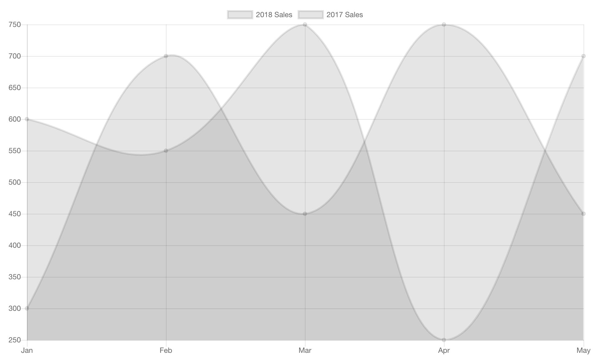
data: [600, 550, 750, 250, 700]
}
]
}
});
Now, if we visit the project’s URL, we should see the similar result:
Configuring Our Line Chart
Coloring The Chart
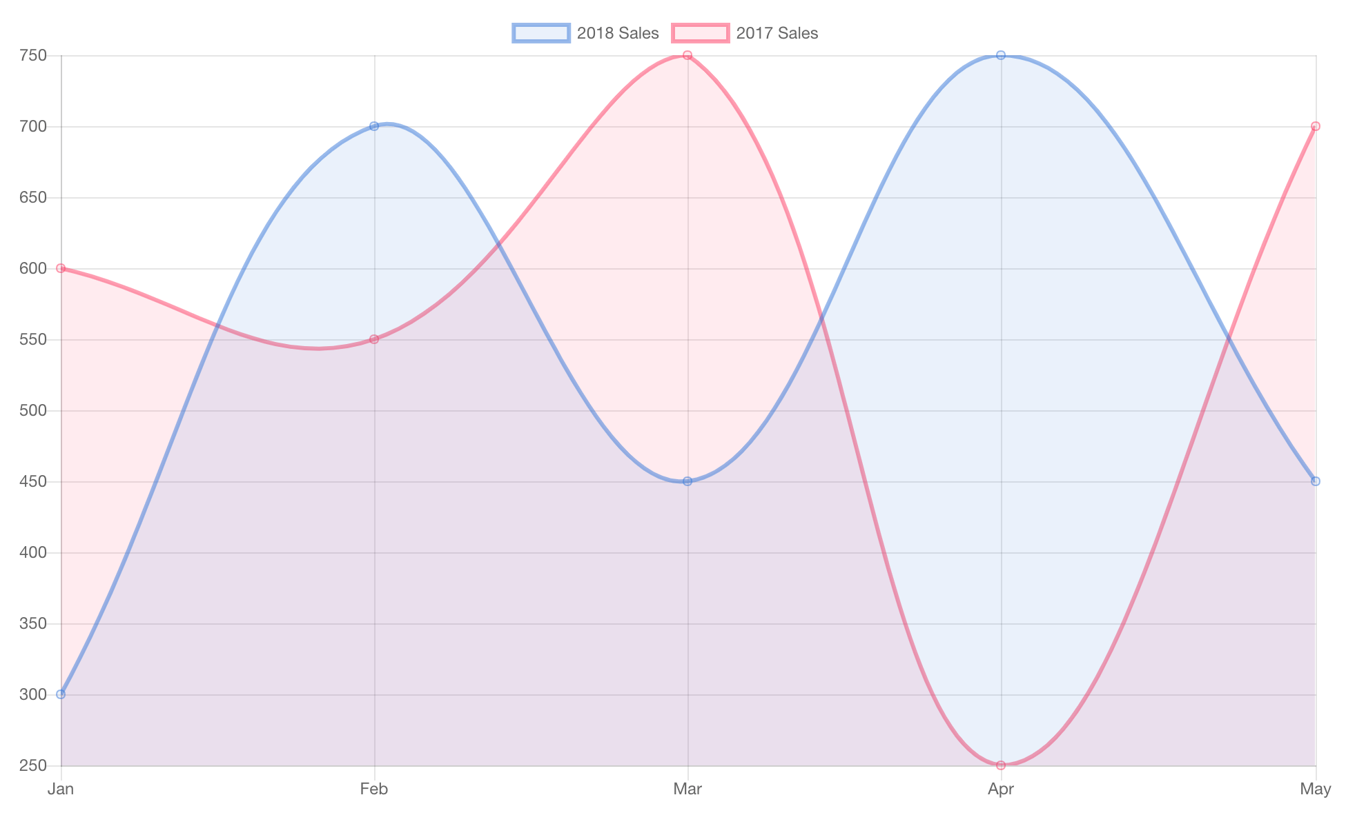
Right now it’s hard to differentiate between the 2018 Sales and the 2017 Sales since both have the same color. We can configure the color for each dataset by providing the backgroundColor and borderColor to each datasets item:
new Chart(document.getElementById('my-chart'), {
  type: 'line',
  data: {
    labels: ['Jan', 'Feb', 'Mar', 'Apr', 'May'],
    datasets: [
      {
        label: '2018 Sales',
        borderColor: 'rgba(50, 115, 220, 0.5)',
        backgroundColor: 'rgba(50, 115, 220, 0.1)',
        data: [300, 700, 450, 750, 450]
      },
      {
        label: '2017 Sales',
        borderColor: 'rgba(255, 56, 96, 0.5)',
        backgroundColor: 'rgba(255, 56, 96, 0.1)',
        data: [600, 550, 750, 250, 700]
      }
    ]
  }
});
Both borderColor and backgroundColor receive a string of color which can be represented in the rgba format—similar to what we have in CSS:
rgba(red, green, blue, alpha)
If we check our project on the browser, we should now have a colorful chart like this:
Configuring the Y-Axis Label
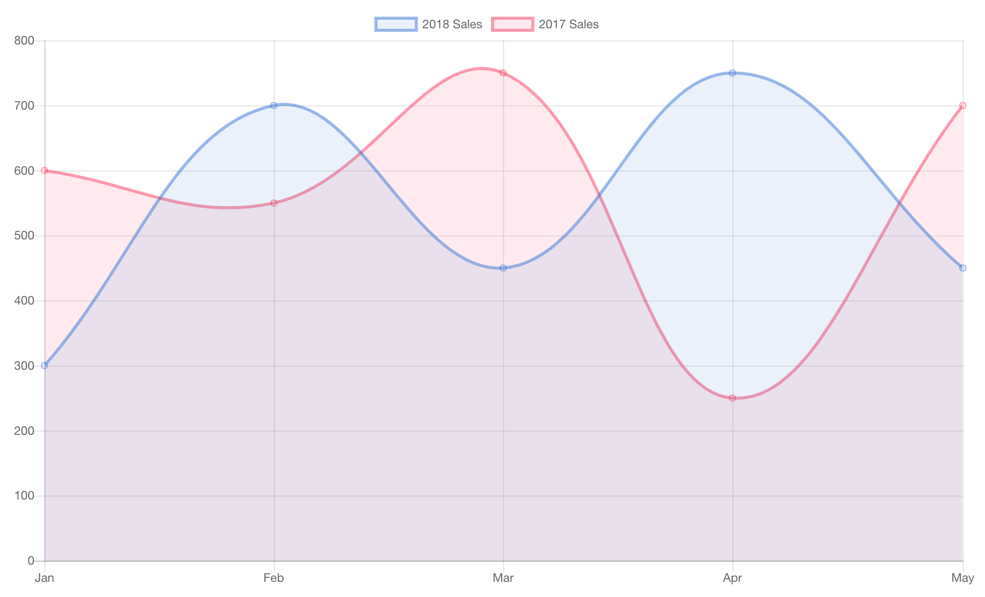
You may have noticed that the y-axis starts from 300 instead of 0. That’s because Chart.js will automatically use the lowest value on our datasets as the starting point. If that’s not what you want, we can override this by providing the beginAtZero option:
new Chart(document.getElementById('my-chart'), {
  type: 'line',
  data: {
    // Omitted...
  },
  options: {
    scales: {
      yAxes: [{
        ticks: {
          beginAtZero: true
        }
      }]
    }
  }
});
Our line chart should now look like the following image.
Also, wouldn’t it be nice if we can put some dollar or other currency symbols on the y-axis? Let’s put it then! But first, let’s pull another library for number formatting: Numeral.js. So we don’t have to deal with the currency formatting on this tutorial 😛.
$ npm install numeral

# Or if you use Yarn
$ yarn add numeral
On ticks property, we can provide a callback option. This is a function that should return a custom axis label. This callback function will receive three arguments, the first one is the actual axis value that we can use:
import Chart from 'chart.js';
import numeral from 'numeral';

new Chart(document.getElementById('my-chart'), {
  type: 'line',
  data: {
    // Omitted...
  },
  options: {
    scales: {
      yAxes: [{
        ticks: {
          beginAtZero: true,
          callback: value => numeral(value).format('$0,0')
        }
      }]
    }
  }
});
The y-axis label should now have the currency symbol. Read more about all available axes configuration and labelling.
Configuring the Tooltip
Even though we already formatted the y-axis label, but if you hover or click on any of the data points, the displayed y-axis value is still not formatted.
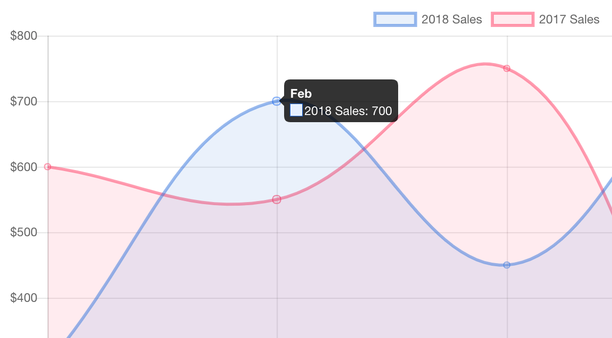
To get around this, we have to provide a function to the tooltips.callbacks.label options like this:
new Chart(document.getElementById('my-chart'), {
  type: 'line',
  data: {
    // Omitted...
  },
  options: {
    scales: {
      // Omitted...
    },
    tooltips: {
      callbacks: {
        label(tooltipItem, data) {
          // Get the dataset label.
          const label = data.datasets[tooltipItem.datasetIndex].label;

          // Format the y-axis value.
          const value = numeral(tooltipItem.yLabel).format('$0,0');

          return `${label}: ${value}`;
        }
      }
    }
  }
});
This label callback, received two arguments:
tooltipItem: An object of the selected data point, we can get the y-axis value by accessing thetooltipItem.yLabel.data: It’s the entire array ofdataproperty provided to the constructor. Combined with thetooltipItem.datasetIndexvalue, we can then get the selected dataset’s label (“2018 Sales” and “2017 Sales”).
If we check our project on the browser again, we should now have a nicely formatted data displayed on our tooltip.

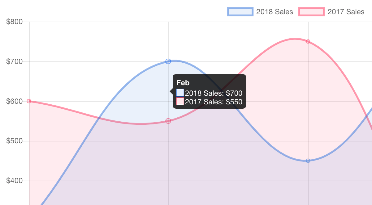
In our case, wouldn’t it be nice if the tooltip can also display the sales amount from both of the datasets? To achieve this, we simply have to set the tooltip’s mode to index:
new Chart(document.getElementById('my-chart'), {
  type: 'line',
  data: {
    // Omitted...
  },
  options: {
    scales: {
      // Omitted...
    },
    tooltips: {
      mode: 'index',
      callbacks: {
        // Omitted...
      }
    }
  }
});
Now, when we hover to some data point, the tooltip should now display the sales amount from both datasets. Read more about all available tooltip configuration and interaction modes.
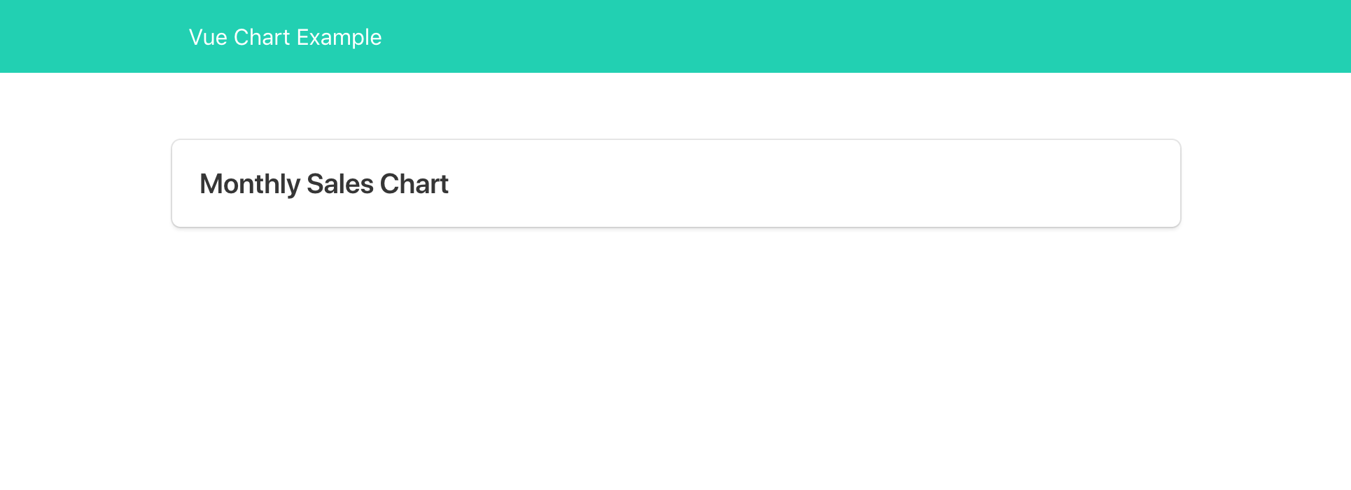
Making it Prettier
Before we start digging into the Vue stuff. Let’s make our web page layout a bit prettier. You can skip this part if you want. I’ll use Bulma for styling up our page.
Open the public/index.html file again, and let’s add some simple navbar and put our <canvas> tag within a box.
<!DOCTYPE html>
<html lang="en">
  <head>
    <meta charset="utf-8">
    <meta http-equiv="X-UA-Compatible" content="IE=edge">
    <meta name="viewport" content="width=device-width,initial-scale=1.0">
    <link rel="icon" href="<%= BASE_URL %>favicon.ico">

    <!-- Load bulma -->
    <link rel="stylesheet" href="https://cdnjs.cloudflare.com/ajax/libs/bulma/0.7.2/css/bulma.min.css" integrity="sha256-2pUeJf+y0ltRPSbKOeJh09ipQFYxUdct5nTY6GAXswA=" crossorigin="anonymous">
    <title>Vue Chart Example</title>

    <!-- Make the container a bit smaller. -->
    <style>
      .container {
        max-width: 720px;
      }
    </style>
  </head>
  <body>
    <noscript>
      <strong>We're sorry but vue-chart-example doesn't work properly without JavaScript enabled. Please enable it to continue.</strong>
    </noscript>

    <!-- Bulma's navbar declaration. -->
    <nav class="navbar is-primary">
      <div class="container">
        <div class="navbar-brand">
          <a class="navbar-item" href="/">
            <h1>Vue Chart Example</h1>
          </a>
        </div>
      </div>
    </nav>

    <!-- Put the canvas around the box. -->
    <section class="section">
      <div class="container">
        <div class="box">
          <h2 class="title is-5">Monthly Sales Chart</h2>
          <canvas id="my-chart" width="500" height="300"></canvas>
        </div>
      </div>
    </section>
    <!-- built files will be auto injected -->
  </body>
</html>
I won’t go into detail. It just some basic Bulma UI elements. Now we should have some decent looking layout.

Integrating Chart.js into Vue
Now, let’s work on the real issue here. How can we integrate our chart into a Vue application?
Setting Up the Vue Application
Let’s recreate the Vue application that once we’ve deleted before. Open up the public/index.html file again. Remove the <canvas> tag and the entire box element. Then add back the <div id="app"></div>, this is where our application root will be mounted.
<!DOCTYPE html>
<html lang="en">
  <head>
    ...
  </head>
  <body>
    ...
    <nav class="navbar is-primary">
      <div class="container">
        <div class="navbar-brand">
          <a class="navbar-item" href="/">
            <h1>Vue Chart Example</h1>
          </a>
        </div>
      </div>
    </nav>
    <section class="section">
      <div class="container">
        <div id="app"></div>
      </div>
    </section>
    <!-- built files will be auto injected -->
  </body>
</html>
Also, add back the src/App.vue file again, this is where we’ll put our Vue application root code.
<template>
  <div class="box">
    <h2 class="title is-5">Monthly Sales Chart</h2>
  </div>
</template>

<script>
export default {
  name: 'app'
}
</script>
Next, let’s replace our main.js file to run the main App.vue component:
import Vue from 'vue';
import App from './App';

new Vue({
  render: h => h(App)
}).$mount('#app');
Our chart should now be gone. It’s just a title and someempty box now. Let’s put back our chart!
The Monthly Sales Chart Component
Let’s create a new Vue component for our monthly sales chart. Create a new file named ‘MonthlySalesChart.vue’ and store it within the src/components directory.
<template>
  <canvas ref="myChart" width="500" height="300"></canvas>
</template>

<script>
import Chart from 'chart.js';

export default {
  name: 'monthly-sales-chart',
  mounted() {
    new Chart(this.$refs.myChart, {
      type: 'line',
      data: {
        labels: ['Jan', 'Feb', 'Mar', 'Apr', 'May'],
        datasets: [
          {
            label: '2018 Sales',
            data: [300, 700, 450, 750, 450]
          }
        ]
      }
    });
  }
}
</script>
You may have noticed, that actually it’s just a code from our very first line chart. Notice how we put the Chart.js instantiation within the Vue mounted hook. That’s because Chart.js needs an access to the actual DOM element to plot the chart. And the <canvas> element will only be available right after this component is mounted.
Also, notice how we’re making use of the $refs property to get the reference to the canvas element.
Now, go back to the src/App.vue file again. Let’s register and use our new MonthlySalesChart component:
<template>
  <div class="box">
    <h2 class="title is-5">Monthly Sales Chart</h2>
    <monthly-sales-chart></monthly-sales-chart>
  </div>
</template>

<script>
import MonthlySalesChart from './components/MonthlySalesChart';

export default {
  name: 'app',
  components: {
    MonthlySalesChart
  }
}
</script>
If things go well, we should see the line chart again:
The Line Chart Component
Let’s take our Vue and Chart.js integration even further. We can abstract away the MonthlySalesChart component into a more general component: LineChart. Create a new file named LineChart.vue and store it within the src/components directory.
<template>
  <canvas ref="myChart" :width="width" :height="height"></canvas>
</template>

<script>
import Chart from 'chart.js';

export default {
  name: 'monthly-sales-chart',
  props: {
    // The canvas's width.
    width: {
      type: Number,
      validator: value => value > 0
    },

    // The canvas's height.
    height: {
      type: Number,
      validator: value => value > 0
    },

    // The chart's data.labels
    labels: Array,

    // The chart's data.datasets
    datasets: {
      type: Array,
      required: true
    },

    // The chart's options.
    options: Object
  },
  mounted() {
    new Chart(this.$refs.myChart, {
      type: 'line',
      data: {
        labels: this.labels,
        datasets: this.datasets
      },
      options: this.options
    });
  }
}
</script>
Notice how we turn every configurable value into a component’s props:
width: It’s the canvas’s width in pixel.height: The canvas’s height in pixel.labels: It’s the axis labels that will be passed to Chart.js constructor asdata.labels. It’s not required since it’s possible for us to pass it as anoptionstoo.datasets: The only required props, since this contains the data that we want to plot using Chart.js. This props will be passed to Chart.js constructor asdata.datasets.options: Finally this is the configurationoptionsfor the Chart.js.
Let’s modify our src/component/MonthlySalesChart.vue file to use this new LineChart component.
<template>
  <line-chart
    :width="500"
    :height="300"
    :labels="['Jan', 'Feb', 'Mar', 'Apr', 'May']"
    :datasets="$options.datasets"
  ></line-chart>
</template>

<script>
import LineChart from './LineChart';

const datasets = [
  {
    label: '2018 Sales',
    data: [300, 700, 450, 750, 450]
  }
];

export default {
  name: 'monthly-sales-chart',
  datasets,
  components: {
    LineChart
  }
}
</script>
Notice how we put the datasets constant as a custom component’s property instead of part of the usual component’s data. That’s because up until this point our datasets is static and no need to be reactive. So, there’s no use to register it as a data property. We can use the $options to access the custom property.
If things go well, we should still have the same exact chart like before.
Put Back Chart Datasets and Options
Let’s put back all previous datasets and Chart.js options to our MonthlySalesChart.vue file:
<template>
  <line-chart
    :width="500"
    :height="300"
    :labels="['Jan', 'Feb', 'Mar', 'Apr', 'May']"
    :datasets="$options.datasets"
    :options="$options.options"
  ></line-chart>
</template>

<script>
import numeral from 'numeral';
import LineChart from './LineChart';

const datasets = [
  {
    label: '2018 Sales',
    borderColor: 'rgba(50, 115, 220, 0.5)',
    backgroundColor: 'rgba(50, 115, 220, 0.1)',
    data: [300, 700, 450, 750, 450]
  },
  {
    label: '2017 Sales',
    borderColor: 'rgba(255, 56, 96, 0.5)',
    backgroundColor: 'rgba(255, 56, 96, 0.1)',
    data: [600, 550, 750, 250, 700]
  }
];

const options = {
  scales: {
    yAxes: [{
      ticks: {
        beginAtZero: true,
        callback: value => numeral(value).format('$0,0')
      }
    }]
  },
  tooltips: {
    mode: 'index',
    callbacks: {
      label(tooltipItem, data) {
        const label = data.datasets[tooltipItem.datasetIndex].label;
        const value = numeral(tooltipItem.yLabel).format('$0,0');

        return `${label}: ${value}`;
      }
    }
  }
};

export default {
  name: 'monthly-sales-chart',
  datasets,
  options,
  components: {
    LineChart
  }
}
</script>
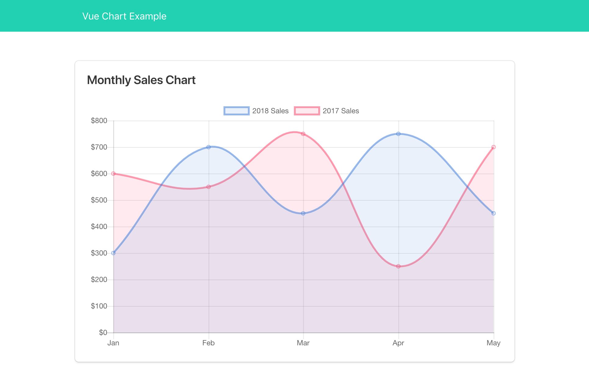
We should now see the Sales 2018 and the Sales 2017 datasets again. The chart that we used to have: two different colors, currency formatted y-axis, and tooltip!
Reactive Chart
Let’s do some experiment with reactive datasets. Open up the src/components/MonthlySalesChart.vue. Then add two new checkboxes that will toggle which datasets to display on the chart.
<template>
  <div>
    <div class="field is-grouped">
      <div class="control">
        <label class="checkbox">
          <input type="checkbox" :value="2018" v-model="selectedYears">
          2018 Sales
        </label>
      </div>
      <div class="control">
        <label class="checkbox">
          <input type="checkbox" :value="2017" v-model="selectedYears">
          2017 Sales
        </label>
      </div>
    </div>

    <line-chart
      :width="500"
      :height="300"
      :labels="['Jan', 'Feb', 'Mar', 'Apr', 'May']"
      :datasets="displayedDatasets"
      :options="$options.options"
    ></line-chart>
  </div>
</template>

<script>
import numeral from 'numeral';
import LineChart from './LineChart';

// Key the datasets by year for easy access.
const datasets = {
  2018: {
    label: '2018 Sales',
    borderColor: 'rgba(50, 115, 220, 0.5)',
    backgroundColor: 'rgba(50, 115, 220, 0.1)',
    data: [300, 700, 450, 750, 450]
  },
  2017: {
    label: '2017 Sales',
    borderColor: 'rgba(255, 56, 96, 0.5)',
    backgroundColor: 'rgba(255, 56, 96, 0.1)',
    data: [600, 550, 750, 250, 700]
  }
};

const options = {
  // Omitted...
};

export default {
  name: 'monthly-sales-chart',
  datasets,
  options,
  components: {
    LineChart
  },
  data() {
    return {
      // Select both years by default.
      selectedYears: [2018, 2017]
    };
  },
  computed: {
    // The datasets to display.
    displayedDatasets() {
      return this.selectedYears.map(year => datasets[year]);
    }
  }
}
</script>
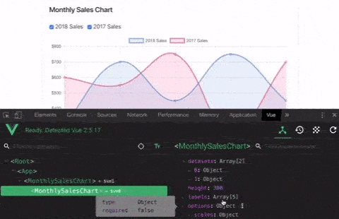
Open up your project on the browser. You should now see two checkboxes. What happens when you toggle both of these checkboxes? Nothing. If you have the Vue Devtools installed on your browser you could see that the datasets props on the LineChart component is indeed updated following these two checkboxes. But that won’t trigger the underlying Chart.js to redraw the chart. Let’s fix this!
Edit the src/components/LineChart.vue file:
export default {
  name: 'monthly-sales-chart',
  props: {
    // Omitted...
  },
  data() {
    return {
      // Data that will hold the Chart.js instance.
      chart: null
    };
  },
  watch: {
    // Watch for the datasets changes.
    datasets(newDatasets) {
      // Replace the datasets and call the update() method on Chart.js
      // instance to re-render the chart.
      this.chart.data.datasets = newDatasets;
      this.chart.update();
    }
  },
  mounted() {
    // Store the created instance.
    this.chart = new Chart(this.$refs.myChart, {
      type: 'line',
      data: {
        labels: this.labels,
        datasets: this.datasets
      },
      options: this.options
    });
  }
}
As you may see, we now store the created Chart.js instance within the chart data property. We then simply watch for the datasets props to change.
...
watch: {
  datasets(newDatasets) {
    this.chart.data.datasets = newDatasets;
    this.chart.update();
  }
}
If the datasets prop is changed. We simply replace the data.datasets property with the new one. We then call the update() method on the Chart.js instance to re-render the chart with new datasets.
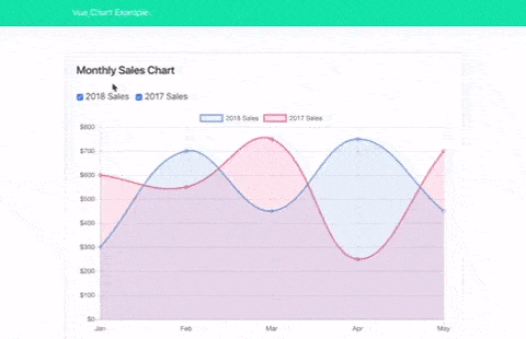
Now if you try to toggle the checkbox, the chart should be updated accordingly.
Before the LineChart component instance is destroyed, it’s a good practice to clear up all the object references and all the event listeners attached to the Chart.js instance. We can do so by calling the destroy() method on the Chart.js instance:
export default {
  name: 'monthly-sales-chart',

  ...

  mounted() {
    // Omitted...
  },

  beforeDestroy () {
    // Don't forget to destroy the Chart.js instance.
    if (this.chart) {
      this.chart.destroy()
    }
  }
}
Closing Thought
There you have it! A reusable chart component for Vue! You can check out the complete source code on Github and play around with the demo here: risan.github.io/vue-chart-example.
Note that on our case we only anticipate changes on the datasets prop. But of course, you might have a case where the labels or even the options are possible to change too. In that case, don’t forget to watch for changes on those props too. Replace the associated chart’s configuration, and call the update() method to re-render the chart.
There other chart types available on Chart.js, like bar, pie, scatter, and even mixed type. Why don’t you try to abstract away the LineChart component into something that’s even more general; like BaseChart? Which later you can extend to create various chart types.